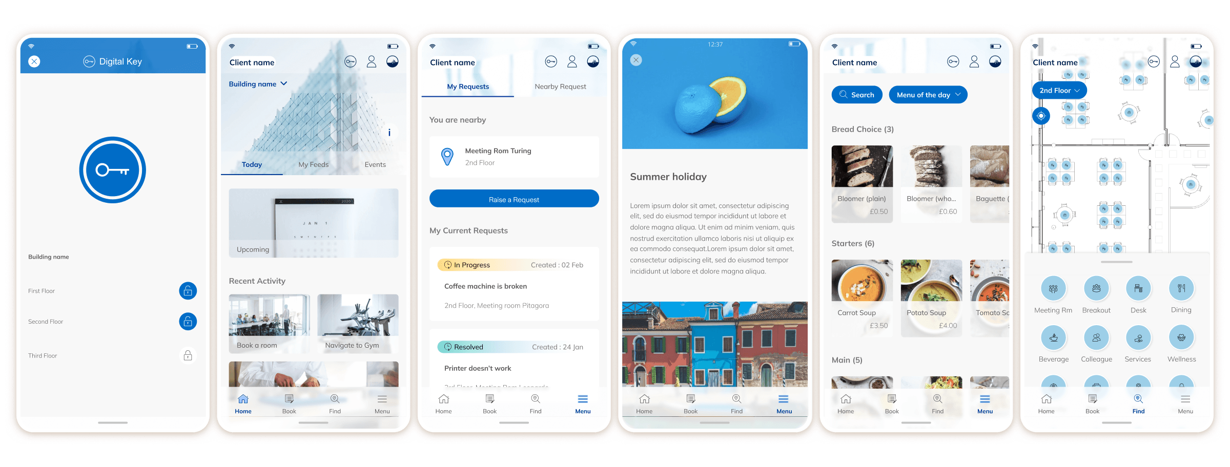
Strategic Intervention 1
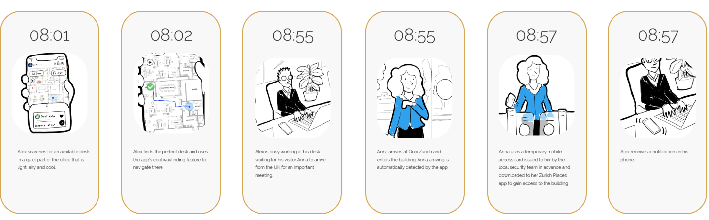
Reframing Client Engagement
Problem
Clients struggled to articulate meaningful experience requirements and defaulted to feature lists.
My decision
I restructured the client engagement model, replacing requirement collection with collaborative discovery.
What I did
- Designed a three-step workshop engagement model
- Shifted presentations from technical to narrative and visual
- Facilitated discovery, UX, and prioritisation workshops with internal and external stakeholders
Result
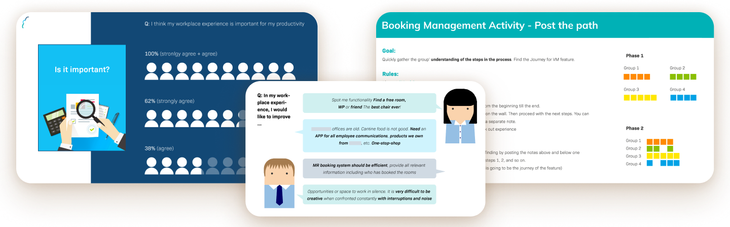
The workshops, along with the interviews I conducted and the simplified presentation to boards members, allowed us to deep dive
into general requirements and to present effective outcomes. An
example from one of our main client.
- Number of initial clients requirements: 24
- Requirements gathered during workshops and presentations: 210
- Pain points surfaced during interviews: 57
- Final accepted requirements: 182
The engagement grew from a few hundred thousand to a multi-million contract.
Strategic Intervention 2
Establishing UX Fundamentals
Problem
As a B2B2C project, our stakeholders lacked core UX foundations:
- Vague personas
- No shared mental model of end users
- No framework for adoption strategy
What I did
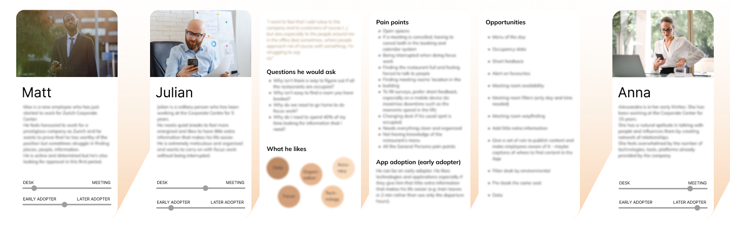
I diplomatically proved the need behind research, and ran internal empathy workshops to create initial persona hypotheses. I validated and refined them through quantitative and qualitative research with the end users, and introduced three core personas with an adoption-scale lens:
- The new starter
- The organiser
- The veteran
Findings
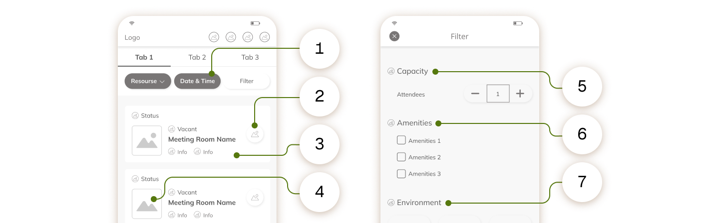
One of the most significant pain point of our Personas was to find a free meeting room to book.
I investigated that goal and I mapped the needs for Matt, Julian, and Anna:
- Find a meeting room on a specific day, time and length
- Book a meeting room immediately with no additional steps
- Have as many information as possible about each room
- Recognise at a glance whether the room suits the meeting (look and feel, space, seats, devices)
- Choose the size of the room
- Choose the amenities available
- Choose environmental data
These findings directly shaped the app’s information architecture.
Test and iterate
Following the design thinking approach, I conducted remote usability testing with two sets of users:
- First-time users, to assess usability
- Experienced stakeholders, to evaluate to see how learnability improved with repeated use.
(5 participants per group, across 2 iterations).
Tasks combined qualitative scenarios (organise a meeting with a colleague and reserve a room) with quantitative ones (book a video-conferencing room for 2 September at 10:30, for two hours), so we could measure performance and ROI while observing wider behaviour.
Key findings:
Initial complexity was quickly overcome.
Average task completion time dropped from 2 minutes to 30 seconds after the first use, and users said they felt confident using the app again.
“I’ve never used the app and it was very good. I feel confident that
after the first use, I can use it with no problems in the future.”
This validated our focus on learnability over instant perfection, a key success factor for apps designed for repeat-use workplace tools.
This validated our focus on learnability over instant perfection, which matters for tools people use repeatedly. Two quick fixes then reduced the remaining first-time issues:
Improve CTA discoverability.
Some users didn’t realise they had to tap the booking icons to reserve a space. I recommended a one-step onboarding that points to the right action.
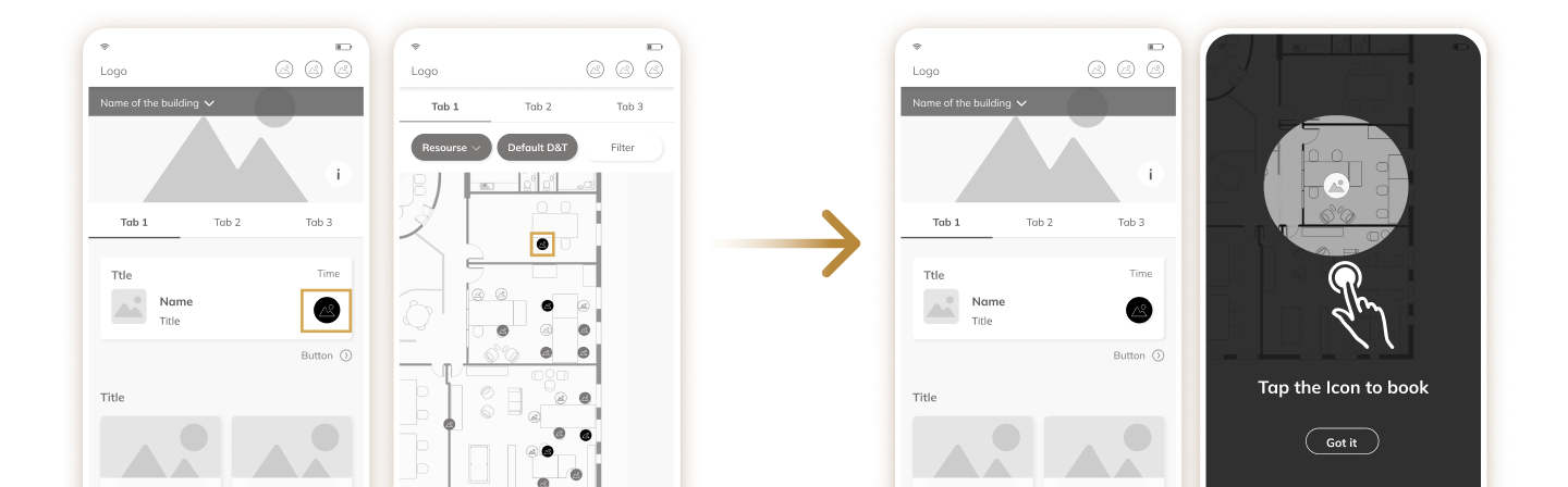
Change horizontal scrolling” and visual affordance.
Users tapped the legend button to book, and older users didn’t notice the screen scrolled sideways, despite familiar patterns like Google Maps and Netflix. I proposed reshaping the button to match information-legend conventions and changing the legend’s behaviour.
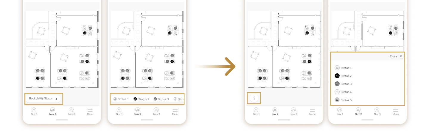
Both fixes closed the gap between first-time and repeated use.
Strategic Intervention 3
A Platform Clients Could Shape
The problem
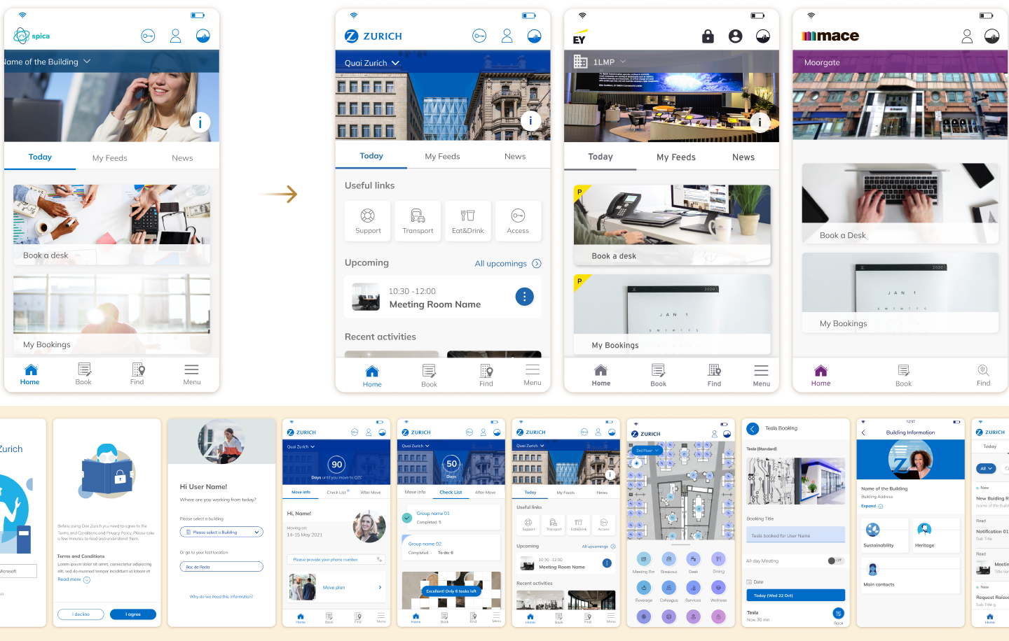
Every enterprise client wanted the product to feel like their own, with their brand and their mix of services. But Spica had never built a native mobile app, and a bespoke app per client wasn’t viable.
My decision
I designed the app as modular features, configurable in both appearance and capability, so customisation wouldn’t cost consistency.
What I did
- Defined design principles and flexible digital guidelines so each client’s branding could be applied without breaking usability
- Led the creation of a shared library of pattern components used across every module
- Worked with engineers on a system that let clients configure the features they wanted: booking, floor-map navigation, information and events, food and canteen, collaboration with colleagues, building access, visitor management, and more
- Designed natively and adaptively for mobile
This let Spica balance consistency with enterprise-level customisation.
Discover more on:
Impact
- Zurich Insurance: from a few hundred thousand to a multi-million contract
- Spica: revenue doubled in six months
- Adopted by: EY, Mace, Athos, ISS, M&G and others
As a B2B2C product, I worked mainly through client stakeholders and didn’t have direct usage analytics. The evidence came from what clients reported back:
- Zurich used the platform to move all its employees into the new headquarter in Zurich
- After internal testing showed strong employee enthusiasm, EY moved to our app in place of its own. Mace, Athos, ISS, M&G and others followed
- Clients relayed employee feedback on the booking system:
“This is like a dream come true”