
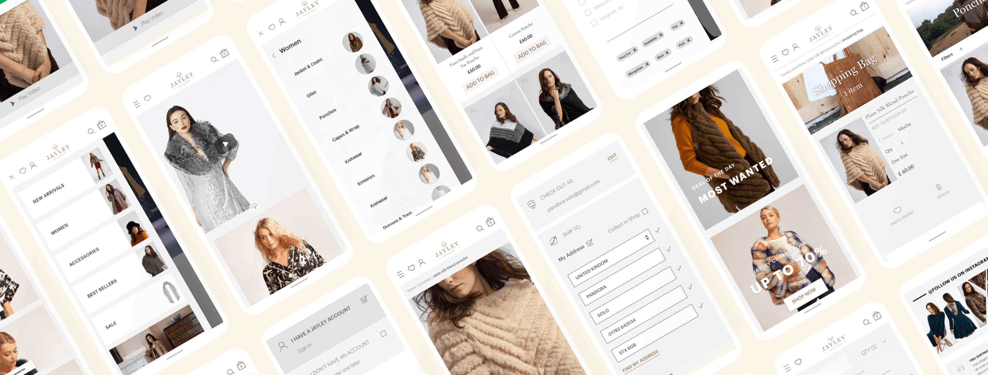
Overview
After working on defining journeys, flows, content and information architecture, I led the visual redesign of Jayley’s e-commerce experience. The core challenge was translating the brand promise into digital: Luxury products at affordable prices The visual language needed to feel aspirational and premium, without creating distance or price anxiety.
Design Strategy: Balance Aspiration and Approachability
I approached the visual system by deliberately working on two opposing forces:
- luxury and
- approachability and ensuring they coexisted coherently across the experience.
Expressing the Luxury Dimension
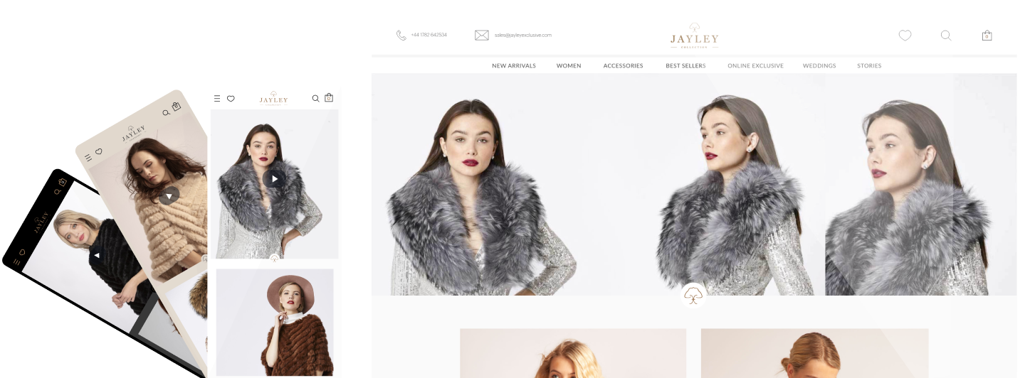
To convey quality, care and aspiration, I focused on:
- Space, balance and rhythm, using generous spacing to elevate perception
- Introducing a light grey background, informed by historical campaign performance and sales feedback:
- Jayley’s gold branding was perceived as more premium on light backgrounds
- Light surfaces were consistently associated with glamour and refinement
- Replacing the homepage carousel with an inspirational video, favouring storytelling over promotions
- Collaborating closely with the stylist to maintain a casual yet polished aesthetic, avoiding excessive formality
Reinforcing Affordability and Price Transparency
To avoid alienating users and support conversion, I made conscious counterbalancing decisions:
- Prices were always visible and legible, with sales clearly prioritised when present
- The homepage was structured around most-clicked categories, supporting fast access over exploration
- Product photography focused on materials and textures, helping users assess value digitally
- I introduced a readable sans-serif (Lato) for body content and retained Cormorant Garamond for headings, aligning with luxury fashion conventions while preserving clarity
- Tone of voice was defined as friendly, supportive, and professional, reducing friction throughout the journey
Digital Style Guide & Design System
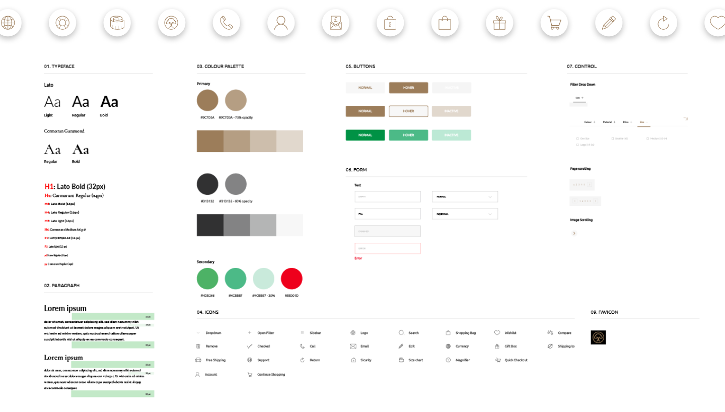
Jayley already had strong offline brand guidelines, but no digital system.
- After gathering input from marketing, social, and e-commerce teams, I created a digital style guide, covering:
- Typography
- Spacing and layout rules
- Colour usage
- Icons
- Core interaction patterns This ensured visual consistency across touchpoints and improved collaboration with the external development agency.
Key Page-Level Decisions
Home Page
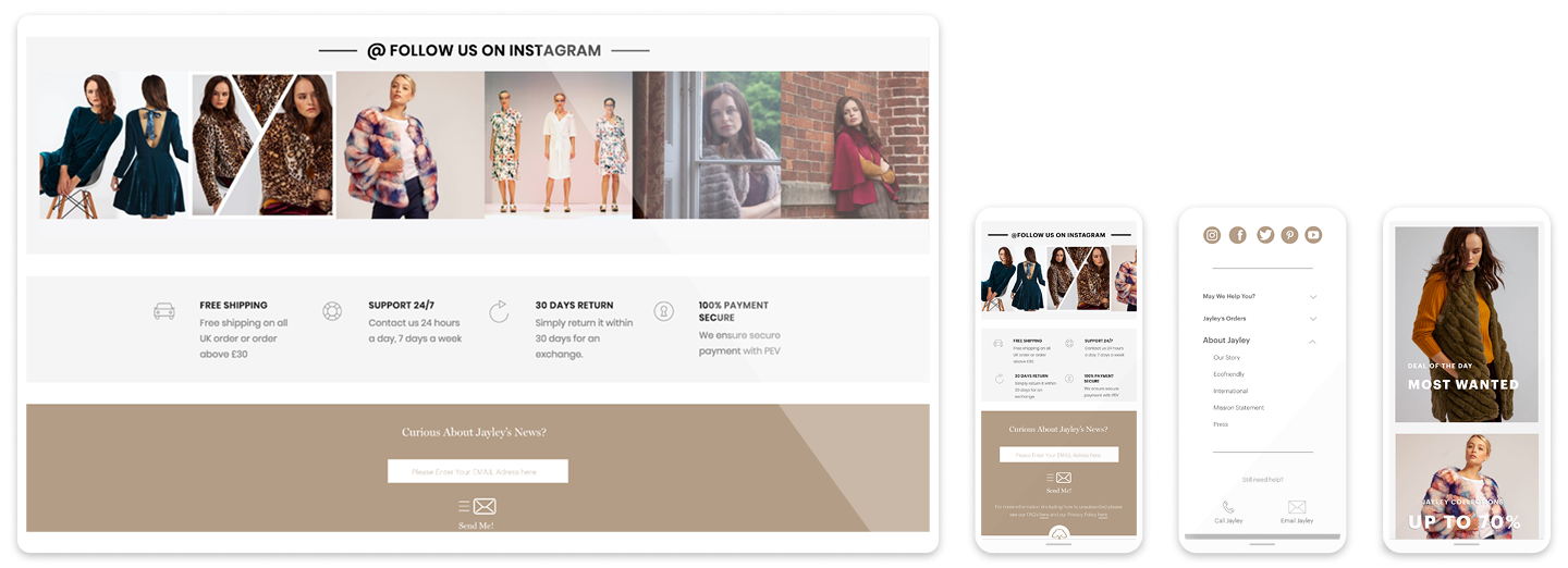
_ Used the logo as a decorative and emotional element, increasing brand recall _ Introduced an Instagram-driven visual section in collaboration with social media
- Designed an interactive newsletter pattern, aligned with the new tone of voice
Category Page
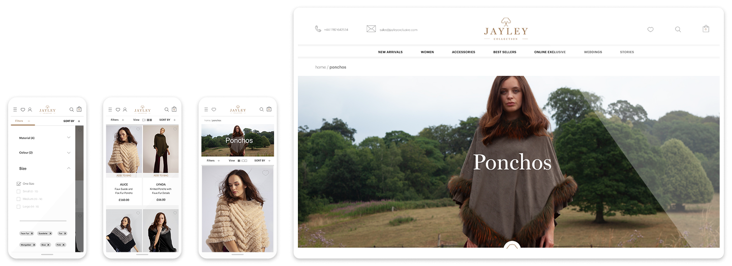
_ Introduced hero images to provide context and inspiration
- Enabled user-controlled view modes, supporting different shopping behaviours
- Added quick “add to bag” to reduce friction
Product Page
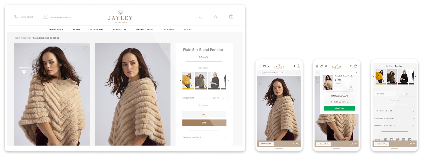
_ Prioritised imagery and product details
- Replaced abstract colour swatches with cropped material photography
- Redesigned the grid for mobile-first usage
- Added a fixed call-to-action with a direct jump to checkout
Checkout Page
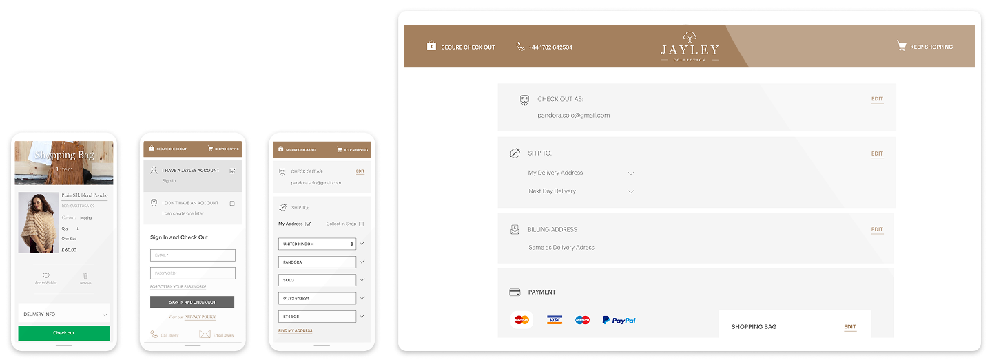
- Moved to a one-step checkout
- Enabled guest checkout, prioritising conversion over forced account creation
- Designed a dedicated checkout environment, reinforcing trust and security
What I Learned
- Designing a system that balanced marketing needs, brand expression, and e-commerce performance was both complex and rewarding.
- If I were to iterate further, I would push accessibility more strongly — a focus that later became a core part of my design practice.