
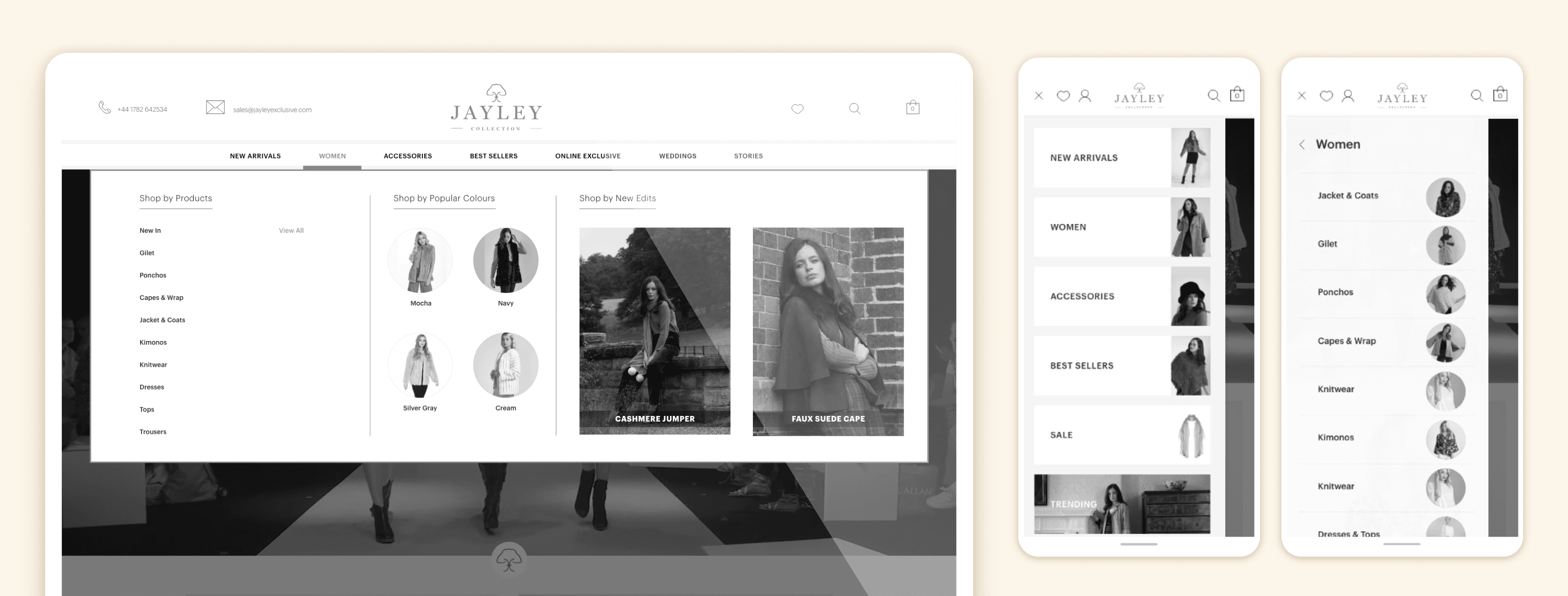
Overview
Jayley is a fast-growing fashion brand offering luxury-inspired products at accessible price points. While the brand was performing strongly in physical retail, its B2C e-commerce platform was underperforming, showing low engagement, high abandonment, and weak customer retention.
The website was functional but fragmented: inconsistent navigation, ineffective filters
The Challenge
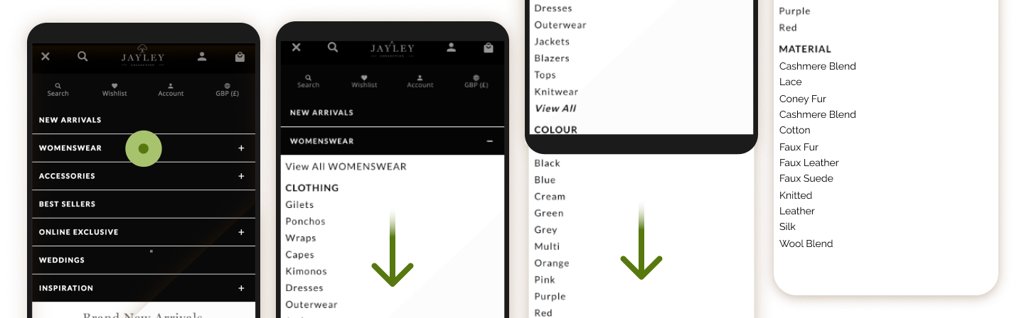
One of the main issues was the confusion around categories:
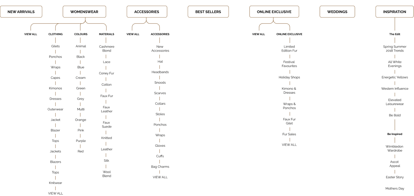
Categories were:
- Repeated with overlapping meanings
- Organised internally rather than from a user perspective
- Difficult to navigate on mobile
- Poorly indexed by search and filters
This lack of information architecture had a cascading effect:
- High drop-off from the home page
- Broken filtering and unreliable search results
- Delivery mistakes caused by misclassified products
- Customer support overloaded with avoidable requests
Strategy: Fix the System, Not the Labels
Given the constraints (no access to users, no A/B testing), I adopted a data-informed, iterative IA strategy. My approach focused on:
- Reducing cognitive load on mobile
- Aligning category logic with user expectations
- Improving findability without increasing complexity
I prioritised the main navigation, as analytics showed the highest abandonment occurred immediately after landing.
How it was
 Proposal
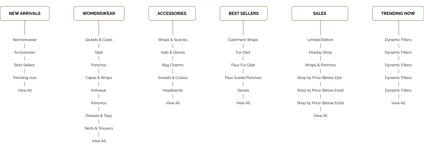
Core Actions on the Main Menu
I worked on five interconnected levers:
- Renaming ambiguous categories
- Reducing the number of subcategories
- Aggregating categories based on behavioural data
- Eliminating repetitions
- Reordering categories based on real usage (not conventions)
Because we couldn’t run card sorting or A/B tests, I proposed monthly incremental changes, measuring impact through analytics. This controlled rollout allowed us to validate decisions while limiting business risk. The process ran over ~12 months.
1. Renaming, Aggregating and Reordering High-Impact Categories
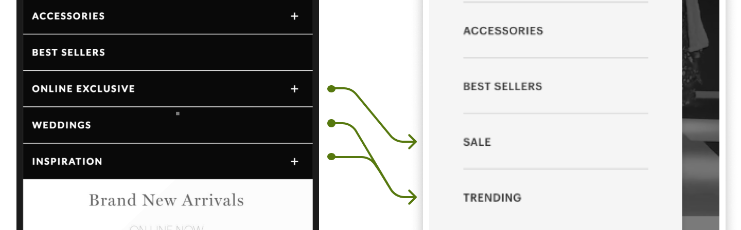
Two categories required immediate attention:
“Online Exclusive” → Sales
“Online Exclusive” was effectively a hidden sale category, yet analytics showed it had one of the highest conversion rates — strongly aligned with one of our personas (“discount chaser”).
The label masked its value and reduced discoverability. I proposed making it explicit and enabling price-led browsing, increasing clarity without cannibalising other channels.
“Weddings” → Trending
The “Weddings” category mirrored B2B wholesale logic and performed well only during short seasonal windows. For a B2C e-commerce, this created dead weight in the main navigation. We deprioritised it in favour of trend-led discovery, targeting the 24–35 audience interested in inspiration rather than occasion-based shopping.
To guide users through familiar patterns, I:
- Grouped capes and wraps under Womenswear, near Jackets and Coats
- Aggregated low-range categories (e.g. Jackets + Coats)
- Reordered categories based on analytics rather than alphabetical logic
We consciously reduced overall “findability” in favour of:
- Faster recognition
- Better experience for returning users
- This trade-off was mitigated by simplifying the navigation structure.
For fast-growing categories, I deliberately expanded subcategories to preserve consistency and support scalability.
2 & 5. Reducing categories, Clarifying Hybrids.
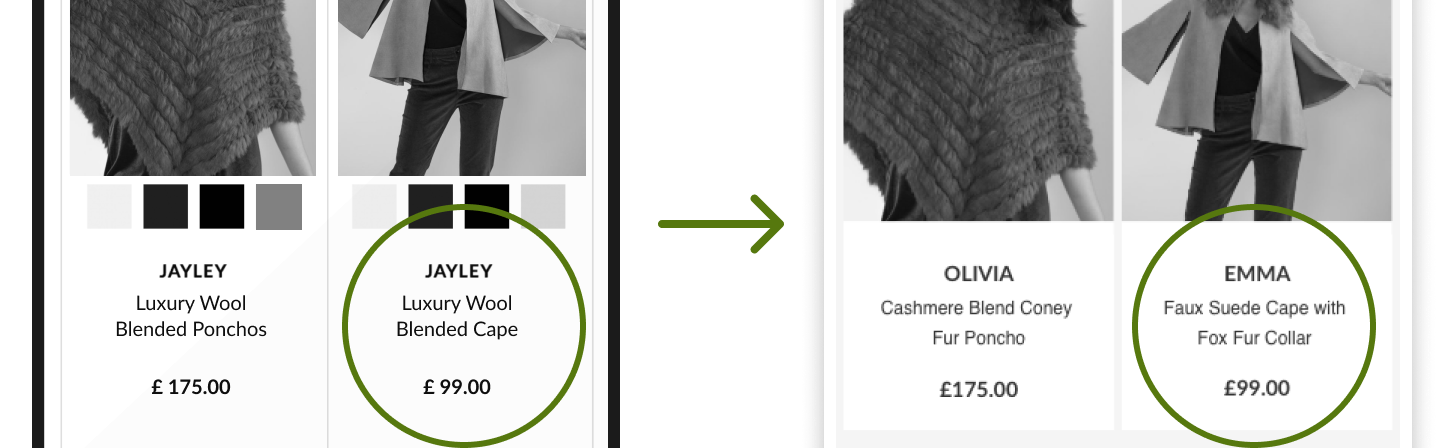
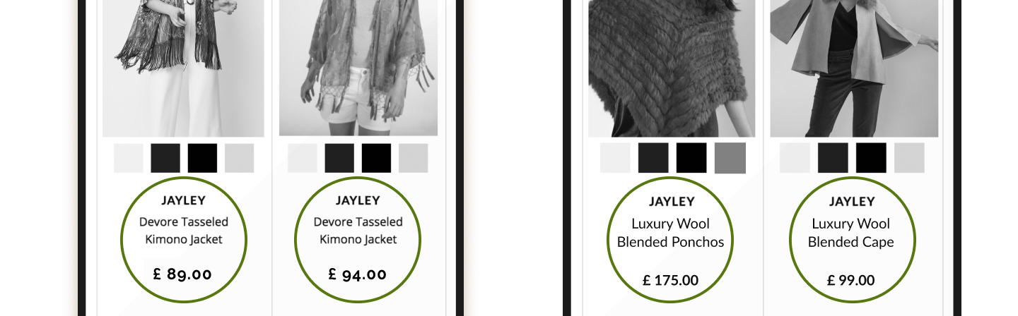
A major IA challenge was hybrid products (ponchos, wraps, capes), which didn’t match customer mental models.
Internally, products were categorised by technical definitions and uploaded by IT, resulting in:
- Near-identical names
- Confusing categorisation
- High customer support volume
I intervened upstream in the system:
- Took ownership of product naming
- Introduced distinctive, human-readable product names
- Aligned naming, category placement, and descriptions
This improved:
- Search performance
- Filter accuracy
- Support team efficiency
Outcomes
Through a customer-centred redesign of UX, IA, and UI, the e-commerce platform achieved:
- +300% engagement
- +17% returning customers
- +35% conversion rate
Improvements were driven primarily by:
- A restructured information architecture
- A redesigned search and filtering experience
- Better SEO performance due to cleaner structure and content hierarchy
- A clearer, more confident visual and interaction language