
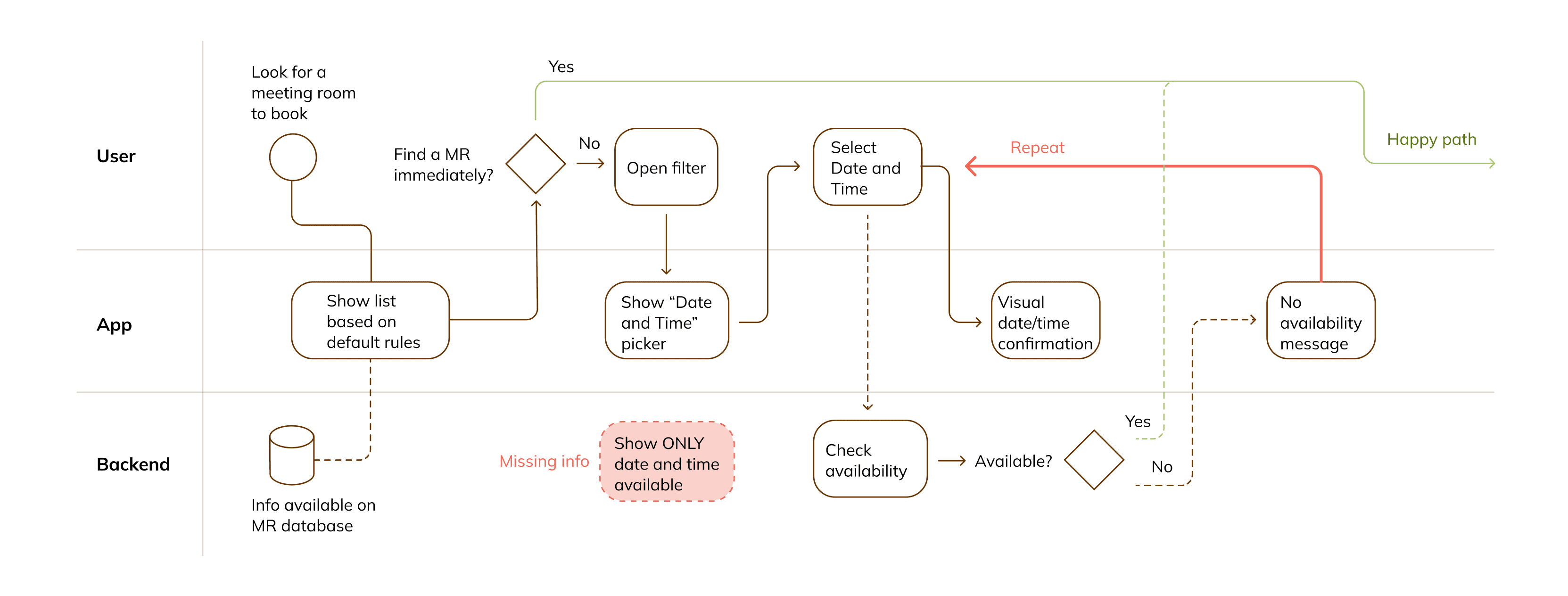
High level concept
Critical UX insight
During the design of a meeting-rooms booking process, I realised that there was a step in the flow that could have been a considerable pain point for the users. Only after the user selected a Date and a Time, the system could call information on that availability to return positive or negative outcomes. This could lead to repeated dead ends and frustration.
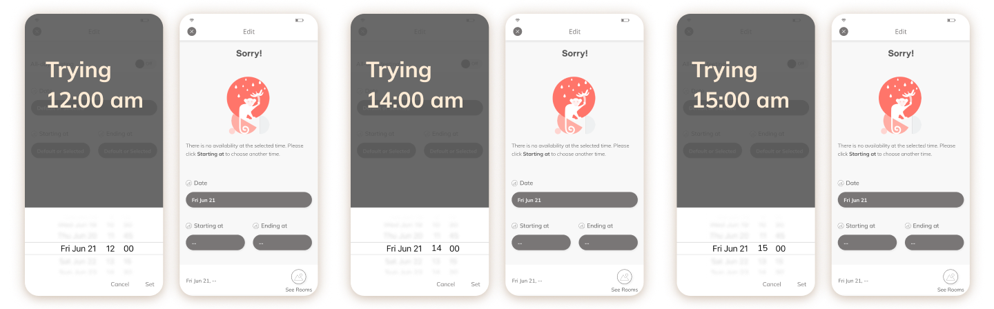
Solving a High-Friction Workflow
I created a mixed service blueprinting/flow chart to show what was happening in the backend. To make it simple, the user found out that a Date and Time was not available only after selecting it. Back to our persona's main frustration (not being able to find a meeting room to book), I could imagine this selection+error occurring multiple times.
My decision
Instead of relying on conventional native components, I redesigned the flow to:
- Expose availability upfront
- Align with users’ mental models (calendar-based booking)
- Prevent errors rather than recover from them
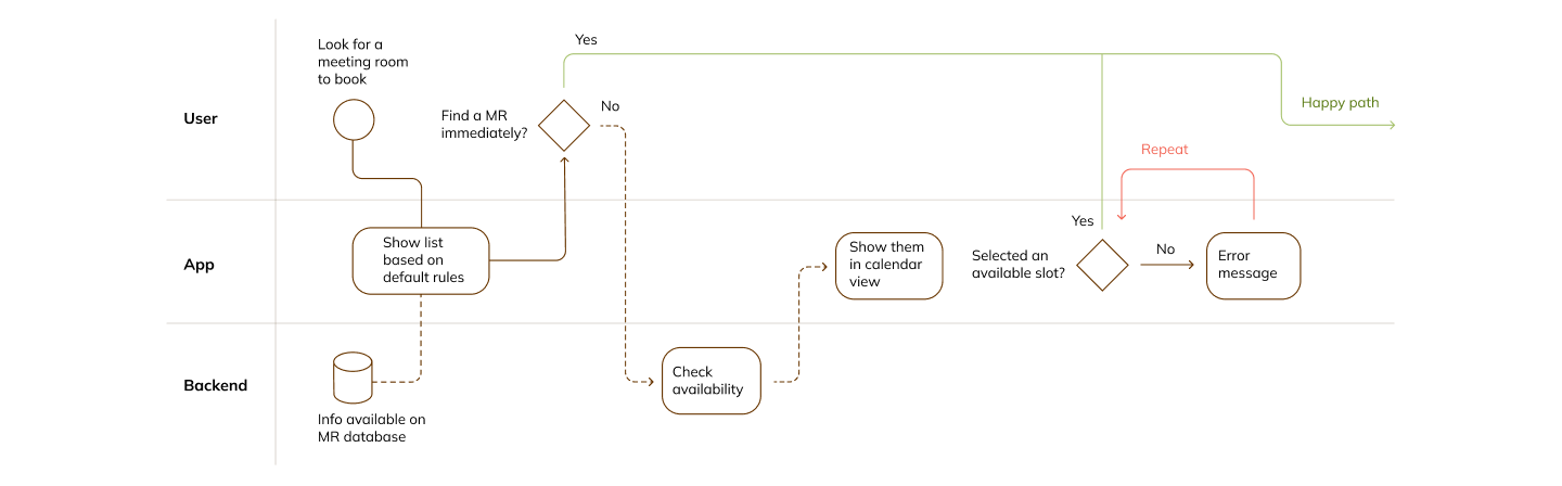
Solution
- Hybrid calendar + availability view
- Direct manipulation for experienced users
- Assistive, constrained flows for accessibility and error prevention
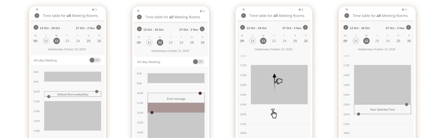
Impact
This approach significantly reduced friction and improved learnability without sacrificing flexibility.
Validation & Learnability
I conducted remote usability testing with:
- First-time users
- Experienced stakeholders Key findings:
- Initial complexity was quickly overcome
- Task completion time dropped dramatically after first use
- Users expressed confidence in repeated use “After the first use, I feel confident I can use it with no problems in the future.” This validated our focus on learnability over instant perfection, a key success factor for repeat-use workplace tools.